Frame style guide
How to Choose a Picture Frame Color
The best frame color supports the image and connects it to the room without matching every piece of furniture. Start with the mood you want, then use the frame to control visual weight.
01
Black frames create a clear edge
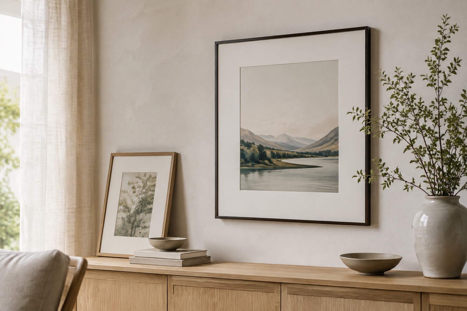
Matte black works well with typography, monochrome photography, modern interiors and high-contrast artwork. It gives the eye a firm boundary and can make a light mat feel especially crisp.
Use a slimmer black profile when the image is delicate. A deeper black box profile can hold its own above furniture or around a large, colorful print.
02
Wood frames bring warmth
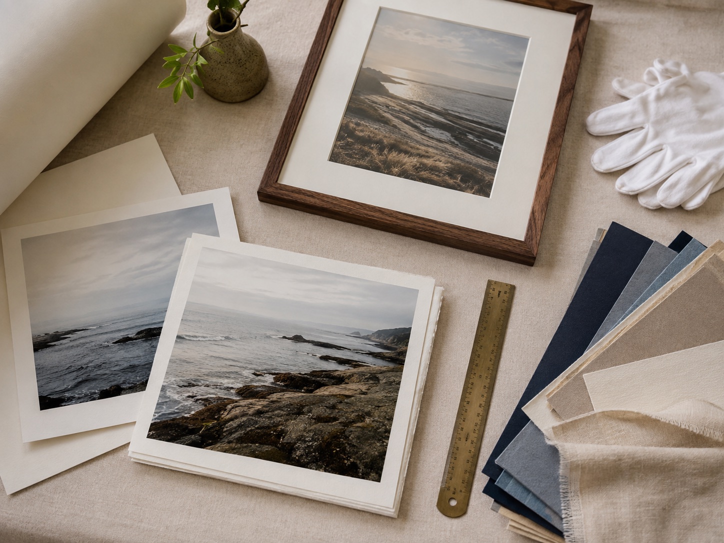
Natural oak and walnut support landscapes, family photographs, botanicals and rooms with woven or earthy materials. Lighter wood keeps a small piece airy; darker wood adds weight and a more grounded feeling.
The frame does not need to match the floor or table exactly. Echo one warm note in the room and let the artwork remain the main color decision.
03
Use white when you want the wall to stay light
White frames can blend into a pale wall and keep the presentation minimal. They are useful for bright photography, soft illustrations and gallery walls where the image should carry most of the contrast.
Always preview frame color with the mat. A warm white frame and bright white mat can look different from a black frame with the same opening.
See it before you order
Put the advice into a real frame.
Upload your picture, compare frame profiles and mats, and check the finished proportions before you commit.
Open the frame builderCommon questions
What color frame goes with everything?
Matte black, natural wood and simple white are the most flexible starting points. Choose among them based on the image’s contrast and the room’s warmth.
Should all frames in a room match?
They do not need to match exactly. Repeating one profile, mat color or visual weight is usually enough to make a mixed collection feel connected.