Mat guide
Picture Frame With a Mat or Without One?
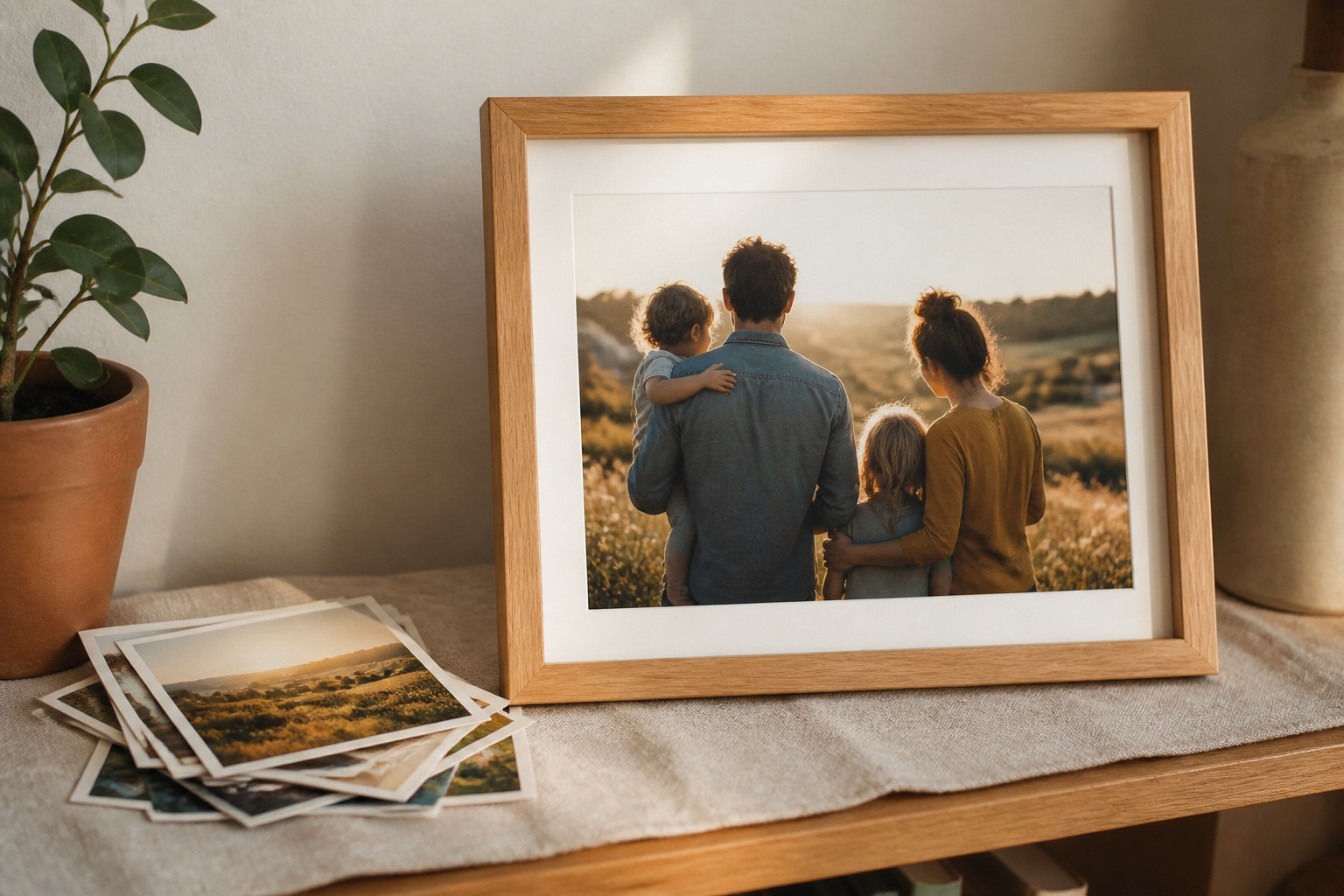
A mat is not just decoration. It changes the scale of the image, creates separation from the glazing and gives the eye a place to pause before it reaches the moulding.
01
Use a mat when the image needs breathing room
A mat is usually helpful for photographs, certificates, illustrations and smaller art prints. It can keep the moulding from feeling too close to the subject and makes a modest image feel more deliberate on a larger wall.
A snow-white mat is the default for a reason: it is quiet, versatile and keeps the color decision focused on the image and the frame.
02
Skip the mat when the edge is part of the design
Full-bleed posters, bold graphic work and images designed to run to the edge can look stronger without a mat. Removing the border keeps the presentation direct and contemporary.
A mat-free presentation also works when the print already has a generous white border or when a gallery wall depends on a consistent, compact rhythm.
03
Choose width by the wall, not a rule
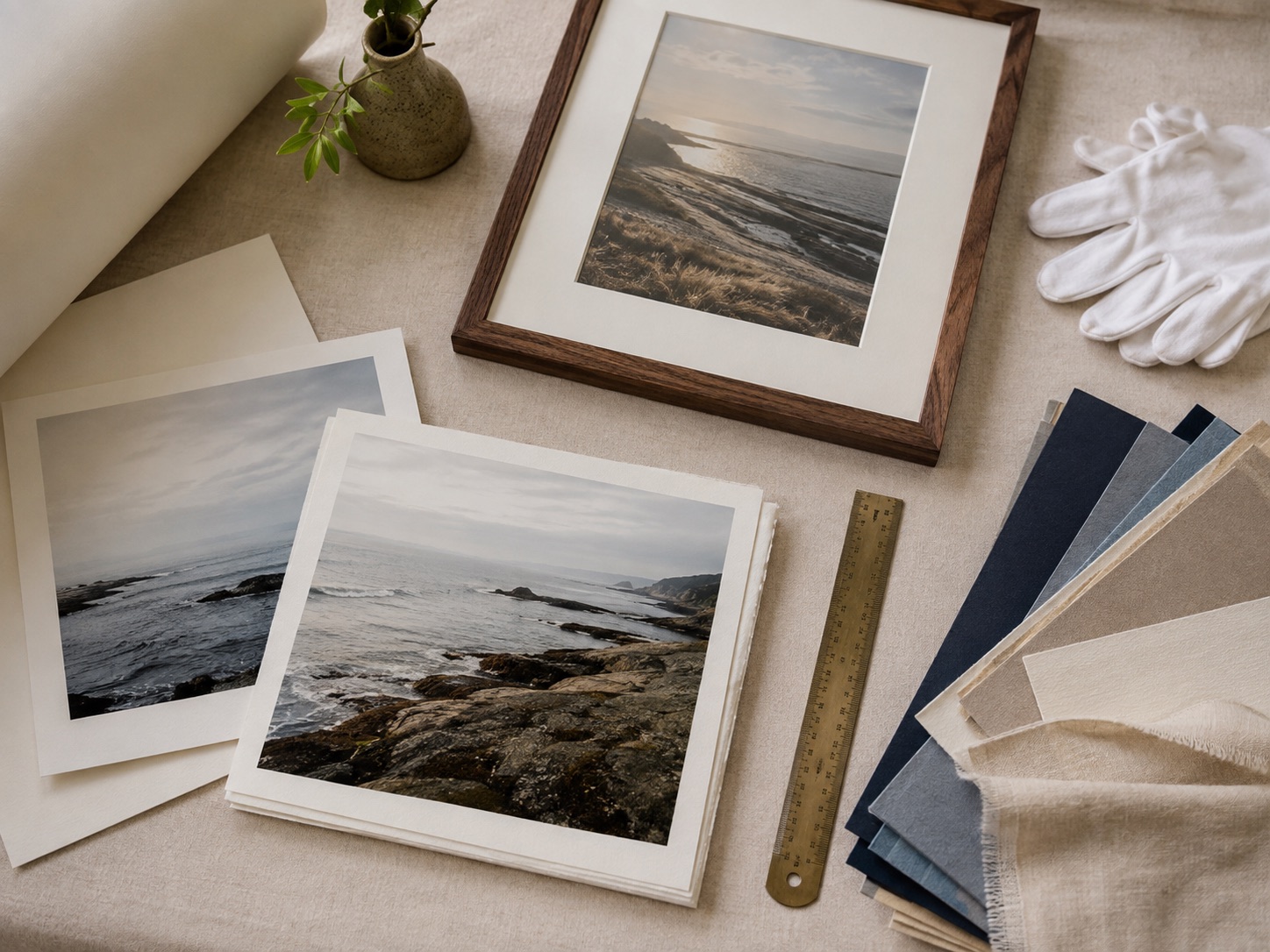
A narrow mat keeps a small frame crisp. A wider mat gives a single larger piece more authority and helps a small image hold its own above furniture. The correct width is the one that balances the visible image and the finished outside size.
Preview both versions at the final frame size. The relationship between the image, mat and room matters more than a universal mat-width formula.
04
Remember the practical benefit
The mat creates space between the print and the glazing. That helps the piece read more cleanly and makes the finished frame feel less like a sheet pressed against a cover.
See it before you order
Put the advice into a real frame.
Upload your picture, compare frame profiles and mats, and check the finished proportions before you commit.
Open the frame builderCommon questions
Is a mat better for photographs?
Often, especially for portraits, family photos and smaller prints. It adds breathing room, but a full-bleed image can look better without one.
What color mat goes with most pictures?
A clean white or warm white mat is the most flexible starting point. Choose a stronger color only when it supports a clear element in the artwork or room.