Art print guide
How to Choose a Frame for an Art Print
The right frame gives an art print room to speak. Start with the paper and image, then choose the mat, moulding and glazing that make the work feel finished without competing with it.
01
Start from the artwork’s edge
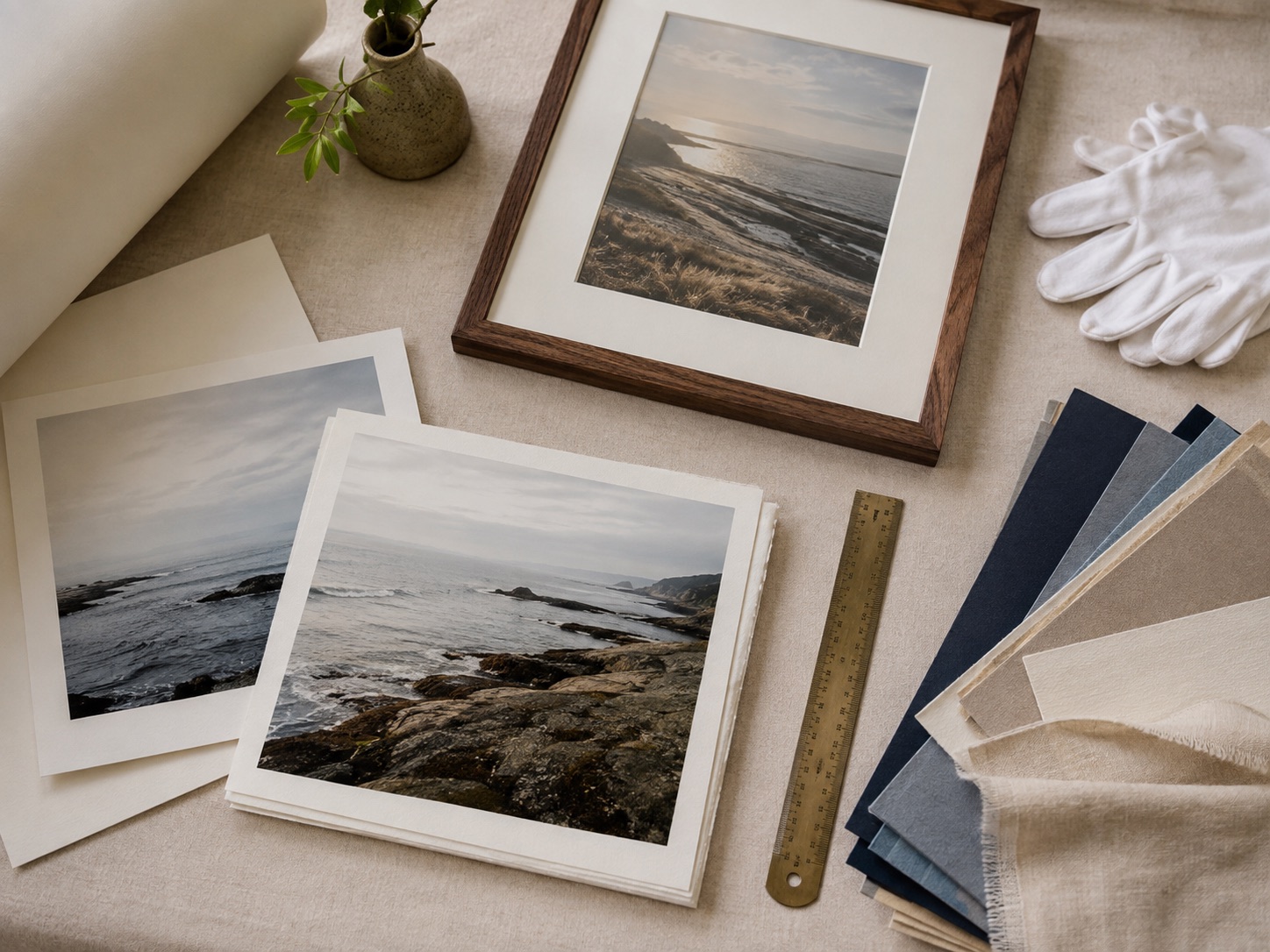
Measure the paper and decide whether the printed border should remain visible. Full-bleed work often wants a simple edge, while detailed or smaller prints benefit from a mat that creates a pause around the image.
Use the visible opening for crop decisions and the outside frame dimensions for the wall. Keeping those measurements separate prevents the frame from becoming unexpectedly large or small.
02
Match moulding to visual weight
A slim frame suits delicate line work and small prints. A deeper or wider profile can support a large, saturated piece or a wall where the artwork needs more authority.
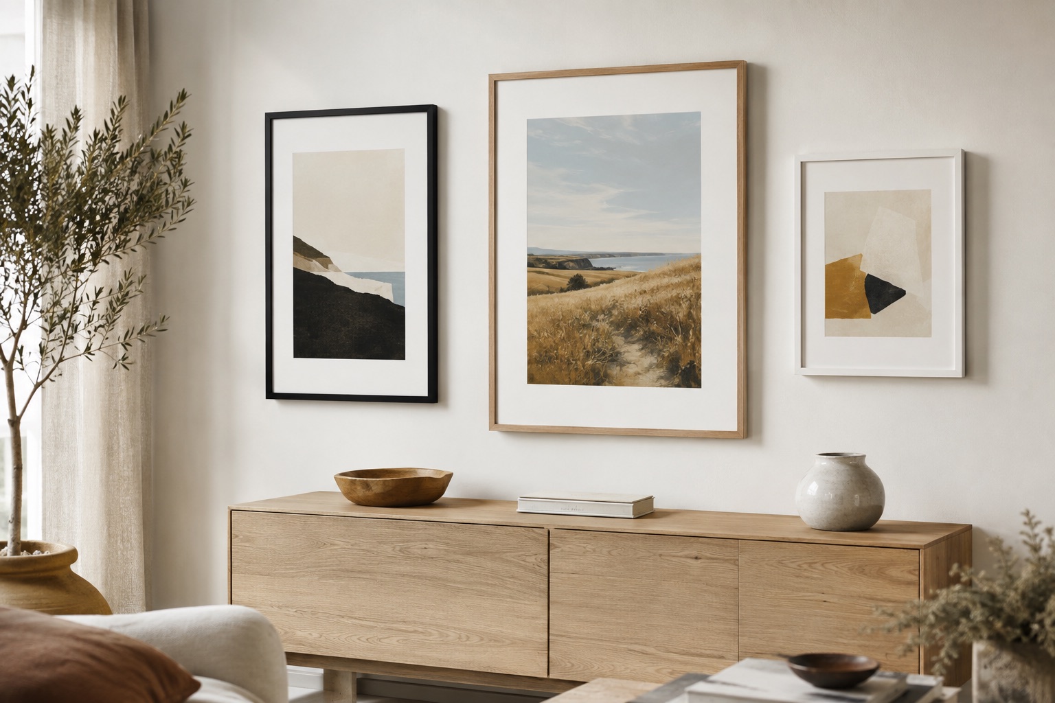
Black gives graphic work a clear boundary, natural wood warms landscapes and botanicals, and white keeps an airy palette light. Preview the frame and mat together rather than deciding from a swatch alone.
03
Treat glazing as part of the viewing experience
Acrylic is light and shatter-resistant, making it practical for many home frames. Reflection control matters especially near windows and lamps, so consider wall placement and surface finish at the same time.
See it before you order
Put the advice into a real frame.
Upload your picture, compare frame profiles and mats, and check the finished proportions before you commit.
Open the frame builderCommon questions
Should art prints always have a mat?
No. Use a mat when the artwork needs breathing room or the frame should be larger than the paper. Full-bleed or strongly graphic designs may look better without one.
What frame color is best for art prints?
Choose based on the print and room. Black is crisp, natural wood is warm and white is light; the best choice is the one that lets the artwork lead.